
The most complete map of EV charging stations


Redesign and monetization of an app built by a community of EV owners. I ran the product research, brought the legacy interface into a design system and designed the monetization features.


2Charges grew out of a community of EV owners. Its USP against Yandex Maps is real-time station status maintained by the community itself: working / occupied, the road is dug up, and above all — the queue to charge.
2Charges is a mobile app for EV owners that lets them quickly find, book and pay for charging stations.
Three core problems

You drive to a charger with an almost empty battery and don’t know whether the station works or has a queue. Accurate real-time status is the main pain.

The product had no monetization. It needed to earn from the community without breaking its trust.

A legacy interface where everything went its own way: mismatched colors, fonts, spacing and rhythm. There was no unified system.
- EV owners are left alone with their problems — there is almost no support.
- Infrastructure is underdeveloped: few stations, chaotic standards, no unification.
- Charging stations have many technical quirks that are hard to understand.
- Plugs, power and interfaces often don’t match — drivers lose time and charge.
- The EV driver community had never been brought together anywhere before.
- Little accessible information on repairs, maintenance and life hacks.
Community

The 2charges audience is EV owners in Russia, mostly men aged 25–45 living in cities with developed infrastructure.
They are progressive, tech-savvy users who value convenience, mobility and sustainable consumption.
They range from newcomers who have just bought an EV and need support to experienced drivers who want to share knowledge, build a community and plan routes around charging stops.


I ran the product through the HSE Art & Design product framework and got 9/10 — a high score :)
covering audience segmentation, personas with real car models, in-depth interviews,
and customer journey mapping — CJM and JTBD. The priorities came out of this analysis.
- Age: 25–45
- Share: ~70% of users
- Income: from 120,000 ₽ a month
- Education: higher, technical / economics
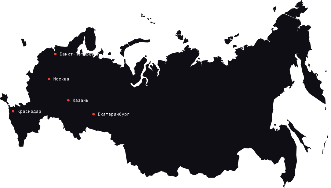
- Location: major cities (Moscow, St. Petersburg, Kazan, Yekaterinburg)
- Digital literacy: high
- Devices: Android — 60%, iOS — 40%
- Interests: cars, technology, gadgets, urbanism, car sharing
- Values: saving time, sustainability, convenience, control
- Age: 27–42
- Share: ~30% of users
- Income: from 90,000 ₽ a month
- Education: higher, humanities / medicine / architecture
- Location: Moscow, St. Petersburg, southern Russia
- Digital literacy: medium to high
- Devices: iOS — 70%, Android — 30%
- Interests: sustainable consumption, urbanism, yoga, travel
- Values: safety, support, mindfulness, simplicity
Customer interviews & insights




“I’m not sure I’ll make it to the next charger”
→ Drivers feel constant anxiety because there is no reliable information about nearby chargers and their status.

“You get there — and it’s the wrong plug or it’s broken”
→ There are not enough visual and technical hints on which charging stations are compatible with which car models.

“There are lots of apps, but none of them does it all”
→ Users are tired of a fragmented ecosystem: navigation in one app, chargers in another, communities in Telegram.

“I really miss a community — I want to ask people like me”
→ A need for a built-in social layer: reviews, comments and on-the-spot help from other drivers.
“I’d like to filter stations by charging speed and price”
→ Interest in saving money, fast charging and building the most efficient route.
“I need a history with technical data — which ports, what peak amps”
→ Men are more interested in the technical side and value extended specs in the app.
“If there were a map with telemetry and an occupancy chart, I’d pay for it”
→ Willingness to pay for pro features with analytics and forecasting.
“I just want it to work — with no glitches”
→ Predictability, emotional comfort and an “intuitive” interface matter.
“I want charging to be a simple routine, not stress — like grabbing a coffee on the way”
→ Turns an anxious experience into a predictable, familiar and calm one.
“I don’t want to be seen as an idiot who doesn’t know where to plug the cable in”
→ Supports self-esteem through built-in instructions and visual metaphors.
Competitors




Combustion-engine fans often criticize EVs for being expensive, relying on “half-baked” infrastructure and depending on a socket. EV drivers hit back at noise, exhaust and outdated mechanics. Behind the argument is more than a choice of transport — it is two views of the future: high-tech and clean, or familiar and proven.
Chargers are built into a navigation app people already use every day. Routing, voice search and payment — all in one app.
A station here is a dot on the map, not a live object. Data comes from operators, so there is no “available now” status and no queue.
The most complete database in Europe and its own payment card that works across different operators’ networks.
The interface is overloaded: lots of features, and newcomers get lost. Station availability is shown inaccurately, and premium is pushed with banners.
Best-in-class filters: you can search for a station not only by connector but also by what’s nearby — coffee, a shop, a restroom.
Drivers set the status themselves, and a “red” mark stays until someone confirms the fix. A working station can be listed as broken for months.
Check-ins, photos and reviews right at the location. Drivers keep the status up to date themselves — the most alive database in the world.
Data quality depends on community density: where active users are few, information goes stale. The interface feels dated.
None of the four has the key thing: real-time station status maintained by the community itself. Yandex gets its data from operators. Zapmap and PlugShare get it from drivers, but without a dense community it goes stale. 2Chargers is built on exactly this: here the community came before the app.
CJM
JTBD


“I want to feel sure I won’t end up with a dead car in the middle of the city”
→ The app gives a sense of safety and control
“I want charging to be a simple routine, not stress — like grabbing a coffee on the way”
→ Turns an anxious experience into a predictable, familiar and calm one
“I want to be part of a community of people like me, so I don’t feel alone in this new reality”
→ Gives a sense of belonging and support through the community and reviews
“I want to feel like a modern, conscious person.”
→ The app reinforces a sense of being progressive, eco-friendly and tech-savvy
“I want to feel calm when I lend my car to my wife / a friend / a relative”
→ Builds confidence that even an inexperienced person can charge with a simple app
“I don’t want to be seen as an idiot who doesn’t know where to plug the cable in”
→ Supports self-esteem and confidence through built-in instructions and visual metaphors












UFLOW
UI Screens
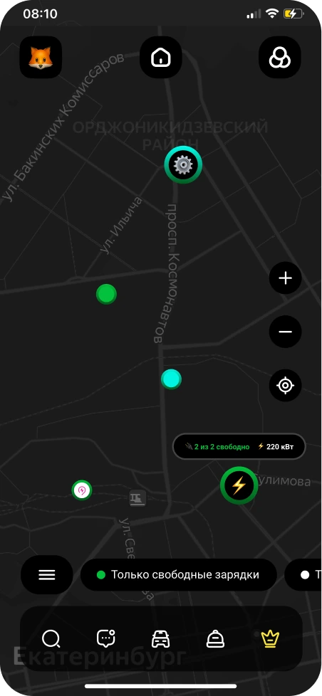
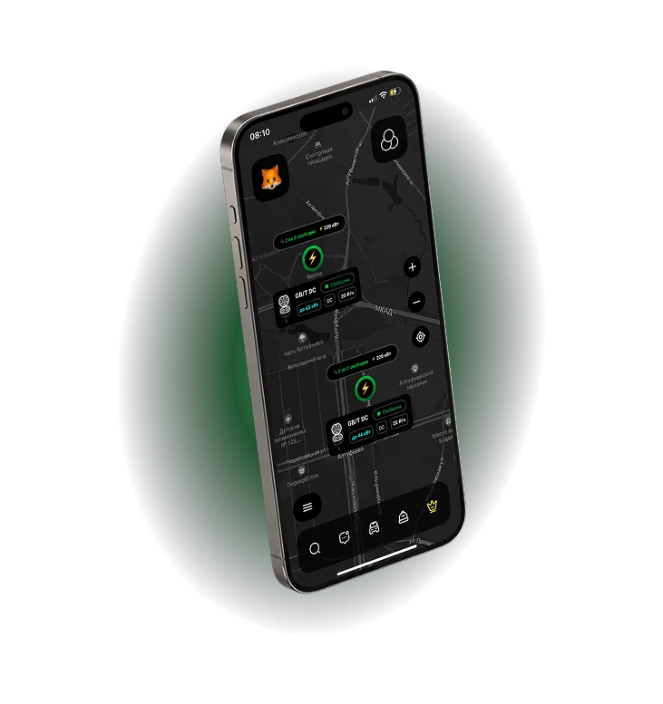
The basic tier: station pins with an “available / occupied” status and an “available chargers only” filter. You can see where to charge.
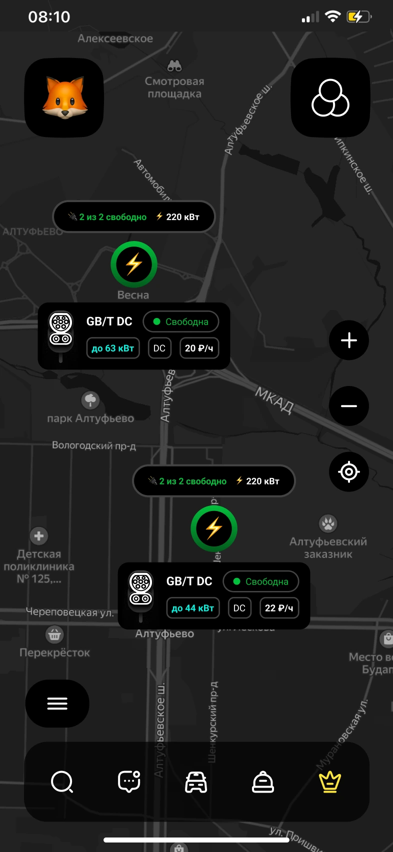
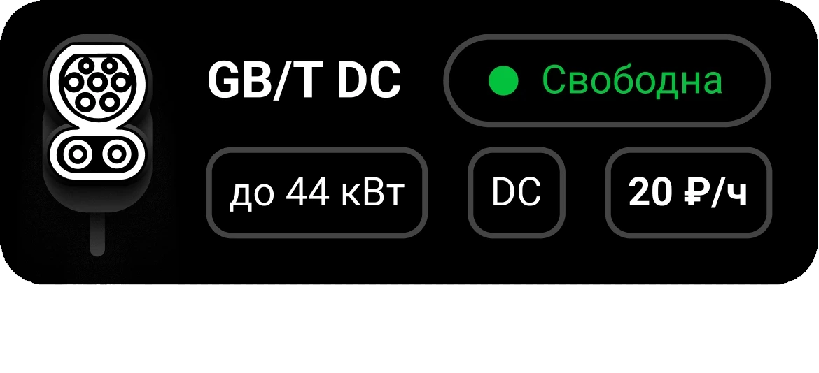
A paid subscription. Connector type, power and price right on the pin: GB/T DC, up to 63 kW, 20 ₽/h, “2 of 2 available”. No need to open the card to see if the station fits.
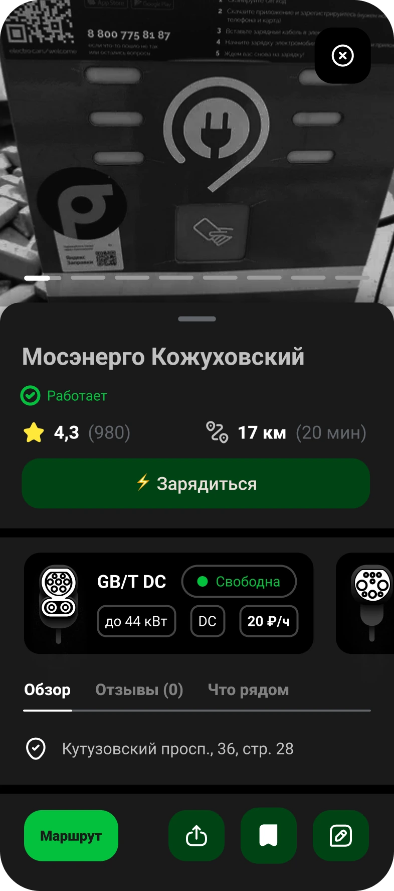
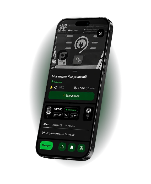
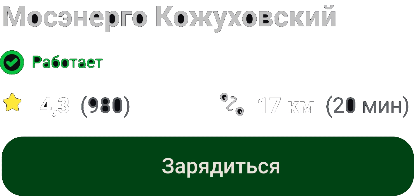
Photos, “Working” status, rating and distance, connectors with power and price, tabs for reviews and “what’s nearby”. From here — “Start charging” and a route.
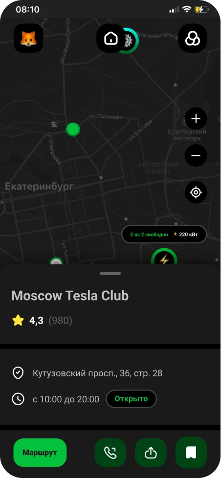
A basic partner listing: rating, address, opening hours, call and route.
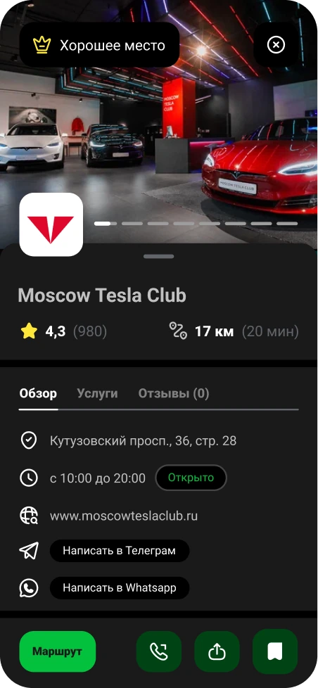
A “Great place” badge, photo gallery, services tab, website, Telegram and WhatsApp.
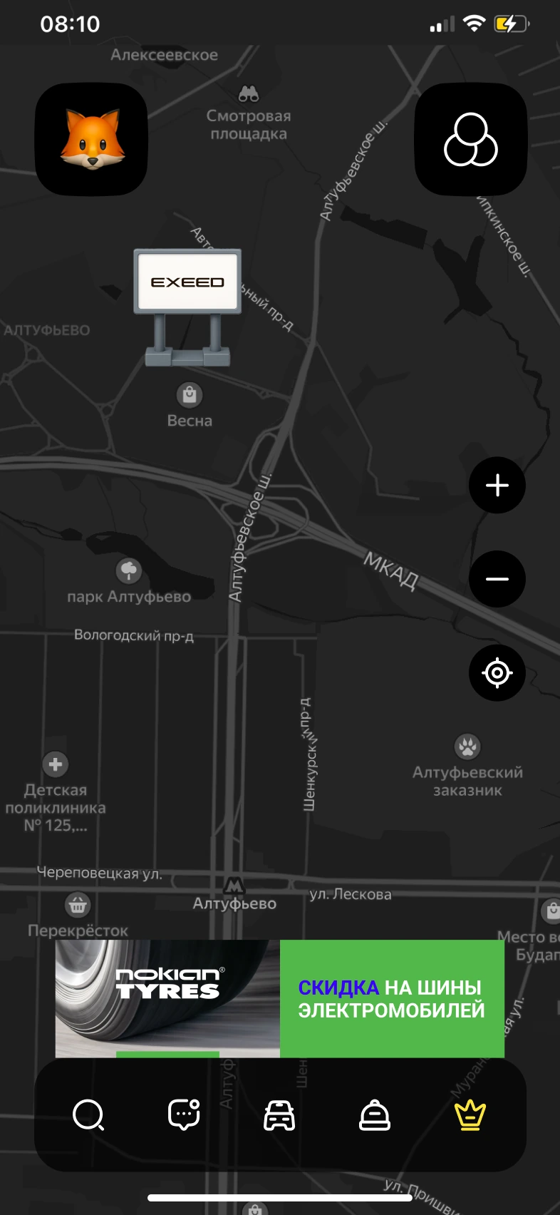
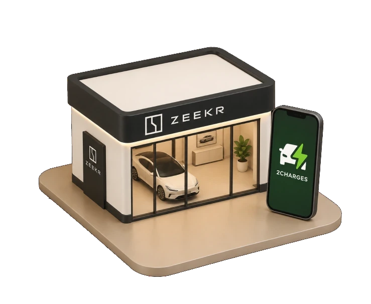
A 3D brand object right on the map and a banner above the tab bar. Ads fit into the context of the trip.
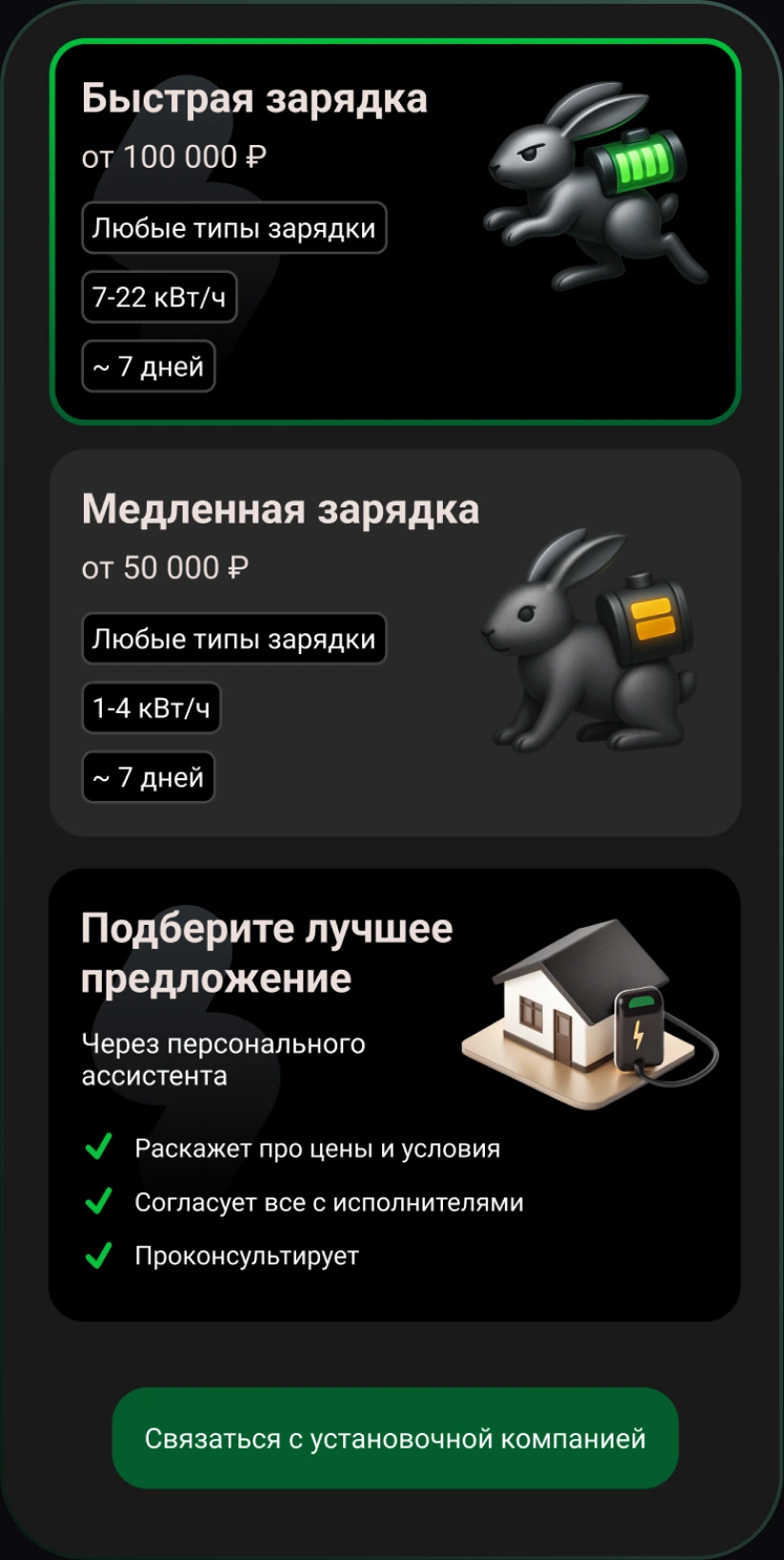
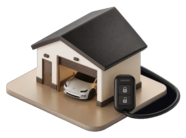
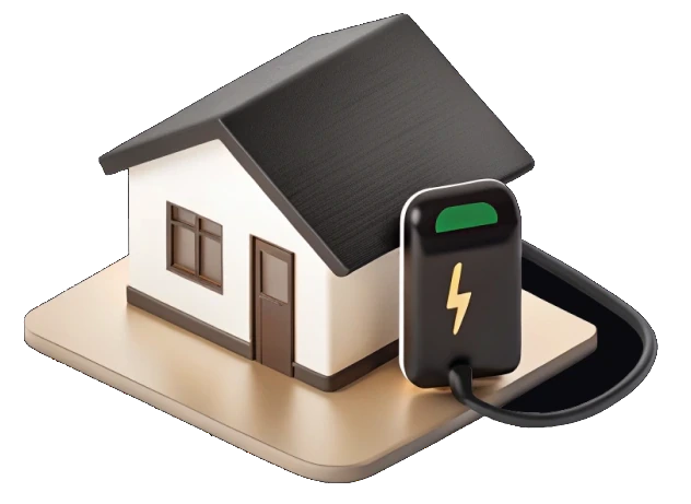
A contractor micro-landing: fast and slow charging with price, power and lead time, a personal assistant and a request form. Monetization through home charger installation.
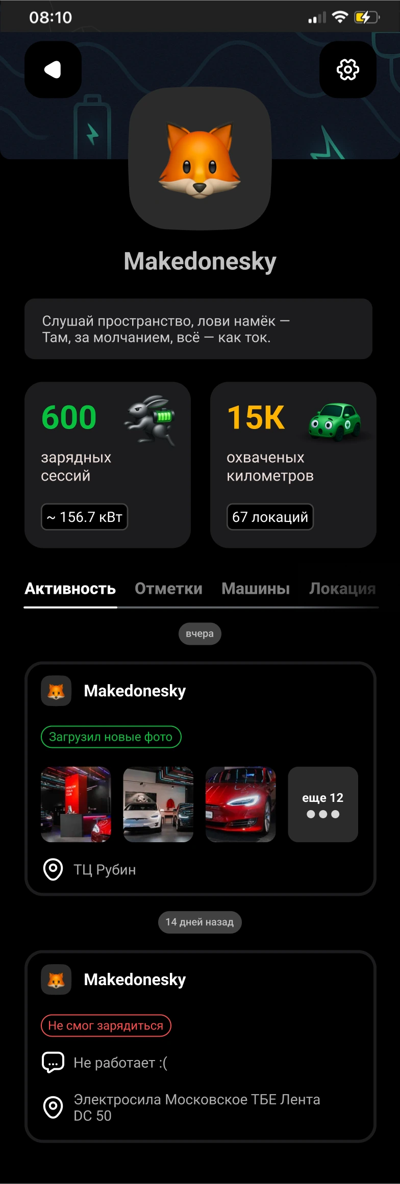
Driver stats: 600 charging sessions, 156.7 kW, 15K km, 67 locations. Below is an activity feed: uploaded station photos and “couldn’t charge” reports.
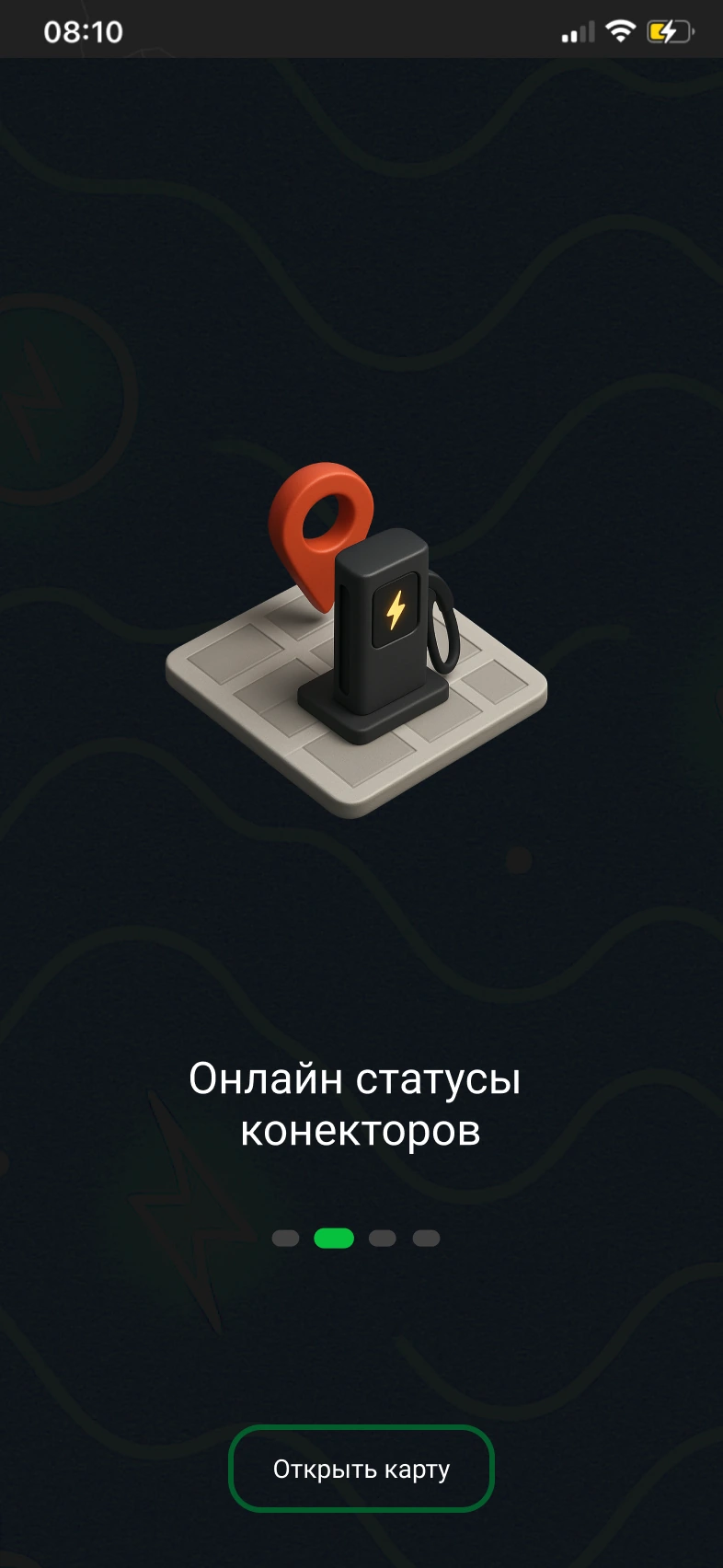
Step two of four explains the core value — live connector statuses. Then straight to the map.
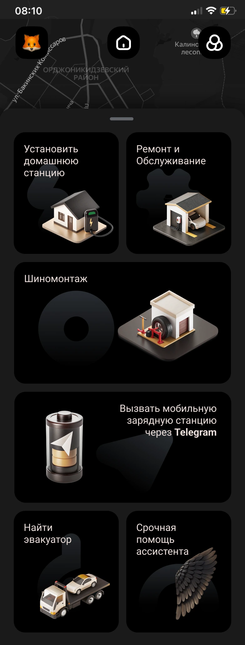
Services around the car: home station, repairs, tire fitting, tow truck and mobile charging via Telegram. Each tile is a request to a partner.
Design system
One set of color, typography and components — every screen in this case is built from it.
Ten product colors: dark theme, action accents and statuses.
The product scale: real font sizes, from screen title to status label.
Action, icon buttons and map filter chips.





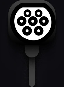
Eight connector types — drivers recognize a station on the map by them.







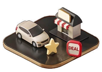
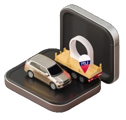
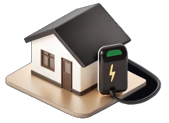
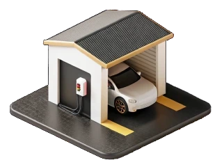
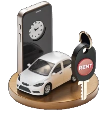
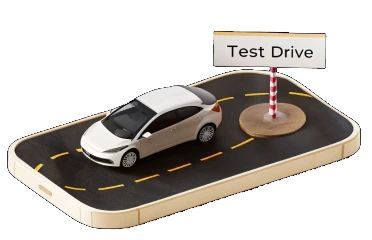
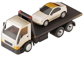
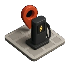
An isometric set: services, places and statuses on the map.

Connector and station — the building blocks of the search screen.
Conclusion
A legacy where everything went its own way — mismatched colors, fonts, spacing and rhythm — was brought into a single system: palette, type scale, components and a set of isometric icons. Defended at HSE Art & Design with a 9/10.
Four monetization formats designed not to break the community’s trust: a subscription for station details, paid place listings, trip-context advertising and home charger installation orders.
The most complete map of EV charging stations
Redesign and monetization of an app built by a community of EV owners. I ran the product research, brought the legacy interface into a design system and designed the monetization features.
2Charges grew out of a community of EV owners. Its USP against Yandex Maps is real-time station status maintained by the community itself: working / occupied, the road is dug up, and above all — the queue to charge.
2Charges is a mobile app for EV owners that lets them quickly find, book and pay for charging stations.
Three core problems
You drive to a charger with an almost empty battery and don’t know whether the station works or has a queue. Accurate real-time status is the main pain.
The product had no monetization. It needed to earn from the community without breaking its trust.
A legacy interface where everything went its own way: mismatched colors, fonts, spacing and rhythm. There was no unified system.
- EV owners are left alone with their problems — there is almost no support.
- Infrastructure is underdeveloped: few stations, chaotic standards, no unification.
- Charging stations have many technical quirks that are hard to understand.
- Plugs, power and interfaces often don’t match — drivers lose time and charge.
- The EV driver community had never been brought together anywhere before.
- Little accessible information on repairs, maintenance and life hacks.
Community
The 2charges audience is EV owners in Russia, mostly men aged 25–45 living in cities with developed infrastructure.
They are progressive, tech-savvy users who value convenience, mobility and sustainable consumption.
They range from newcomers who have just bought an EV and need support to experienced drivers who want to share knowledge, build a community and plan routes around charging stops.
I ran the product through the HSE Art & Design product framework and got 9/10 — a high score :)
covering audience segmentation, personas with real car models, in-depth interviews,
and customer journey mapping — CJM and JTBD. The priorities came out of this analysis.
- Age: 25–45
- Share: ~70% of users
- Income: from 120,000 ₽ a month
- Education: higher, technical / economics
- Location: major cities (Moscow, St. Petersburg, Kazan, Yekaterinburg)
- Digital literacy: high
- Devices: Android — 60%, iOS — 40%
- Interests: cars, technology, gadgets, urbanism, car sharing
- Values: saving time, sustainability, convenience, control
- Age: 27–42
- Share: ~30% of users
- Income: from 90,000 ₽ a month
- Education: higher, humanities / medicine / architecture
- Location: Moscow, St. Petersburg, southern Russia
- Digital literacy: medium to high
- Devices: iOS — 70%, Android — 30%
- Interests: sustainable consumption, urbanism, yoga, travel
- Values: safety, support, mindfulness, simplicity
Customer interviews & insights
“I’m not sure I’ll make it to the next charger”
→ Drivers feel constant anxiety because there is no reliable information about nearby chargers and their status.
“You get there — and it’s the wrong plug or it’s broken”
→ There are not enough visual and technical hints on which charging stations are compatible with which car models.
“There are lots of apps, but none of them does it all”
→ Users are tired of a fragmented ecosystem: navigation in one app, chargers in another, communities in Telegram.
“I really miss a community — I want to ask people like me”
→ A need for a built-in social layer: reviews, comments and on-the-spot help from other drivers.
“I’d like to filter stations by charging speed and price”
→ Interest in saving money, fast charging and building the most efficient route.
“I need a history with technical data — which ports, what peak amps”
→ Men are more interested in the technical side and value extended specs in the app.
“If there were a map with telemetry and an occupancy chart, I’d pay for it”
→ Willingness to pay for pro features with analytics and forecasting.
“I just want it to work — with no glitches”
→ Predictability, emotional comfort and an “intuitive” interface matter.
“I want charging to be a simple routine, not stress — like grabbing a coffee on the way”
→ Turns an anxious experience into a predictable, familiar and calm one.
“I don’t want to be seen as an idiot who doesn’t know where to plug the cable in”
→ Supports self-esteem through built-in instructions and visual metaphors.
Competitors
Combustion-engine fans often criticize EVs for being expensive, relying on “half-baked” infrastructure and depending on a socket. EV drivers hit back at noise, exhaust and outdated mechanics. Behind the argument is more than a choice of transport — it is two views of the future: high-tech and clean, or familiar and proven.
Chargers are built into a navigation app people already use every day. Routing, voice search and payment — all in one app.
A station here is a dot on the map, not a live object. Data comes from operators, so there is no “available now” status and no queue.
The most complete database in Europe and its own payment card that works across different operators’ networks.
The interface is overloaded: lots of features, and newcomers get lost. Station availability is shown inaccurately, and premium is pushed with banners.
Best-in-class filters: you can search for a station not only by connector but also by what’s nearby — coffee, a shop, a restroom.
Drivers set the status themselves, and a “red” mark stays until someone confirms the fix. A working station can be listed as broken for months.
Check-ins, photos and reviews right at the location. Drivers keep the status up to date themselves — the most alive database in the world.
Data quality depends on community density: where active users are few, information goes stale. The interface feels dated.
None of the four has the key thing: real-time station status maintained by the community itself. Yandex gets its data from operators. Zapmap and PlugShare get it from drivers, but without a dense community it goes stale. 2Chargers is built on exactly this: here the community came before the app.
CJM
JTBD
“I want to feel sure I won’t end up with a dead car in the middle of the city”
→ The app gives a sense of safety and control
“I want charging to be a simple routine, not stress — like grabbing a coffee on the way”
→ Turns an anxious experience into a predictable, familiar and calm one
“I want to be part of a community of people like me, so I don’t feel alone in this new reality”
→ Gives a sense of belonging and support through the community and reviews
“I want to feel like a modern, conscious person.”
→ The app reinforces a sense of being progressive, eco-friendly and tech-savvy
“I want to feel calm when I lend my car to my wife / a friend / a relative”
→ Builds confidence that even an inexperienced person can charge with a simple app
“I don’t want to be seen as an idiot who doesn’t know where to plug the cable in”
→ Supports self-esteem and confidence through built-in instructions and visual metaphors
UFLOW
UI Screens
The basic tier: station pins with an “available / occupied” status and an “available chargers only” filter. You can see where to charge.
A paid subscription. Connector type, power and price right on the pin: GB/T DC, up to 63 kW, 20 ₽/h, “2 of 2 available”. No need to open the card to see if the station fits.
Photos, “Working” status, rating and distance, connectors with power and price, tabs for reviews and “what’s nearby”. From here — “Start charging” and a route.
A basic partner listing: rating, address, opening hours, call and route.
A “Great place” badge, photo gallery, services tab, website, Telegram and WhatsApp.
A 3D brand object right on the map and a banner above the tab bar. Ads fit into the context of the trip.
A contractor micro-landing: fast and slow charging with price, power and lead time, a personal assistant and a request form. Monetization through home charger installation.
Driver stats: 600 charging sessions, 156.7 kW, 15K km, 67 locations. Below is an activity feed: uploaded station photos and “couldn’t charge” reports.
Step two of four explains the core value — live connector statuses. Then straight to the map.
Services around the car: home station, repairs, tire fitting, tow truck and mobile charging via Telegram. Each tile is a request to a partner.
Design system
One set of color, typography and components — every screen in this case is built from it.
Ten product colors: dark theme, action accents and statuses.
The product scale: real font sizes, from screen title to status label.
Action, icon buttons and map filter chips.
Eight connector types — drivers recognize a station on the map by them.
An isometric set: services, places and statuses on the map.
Connector and station — the building blocks of the search screen.
Conclusion
A legacy where everything went its own way — mismatched colors, fonts, spacing and rhythm — was brought into a single system: palette, type scale, components and a set of isometric icons. Defended at HSE Art & Design with a 9/10.
Four monetization formats designed not to break the community’s trust: a subscription for station details, paid place listings, trip-context advertising and home charger installation orders.